What makes a good logo today goes far beyond clean lines and clever shapes. A great logo has to communicate a brand’s personality in seconds, hold up across tiny app icons and oversized signage, adapt to dark mode, motion and AI-generated environments — and still be unmistakably yours. Good logo design blends strategy, psychology and practical performance, not just aesthetics.
This guide breaks down what makes a great logo in 2026 and gives you the tools to evaluate your own mark with clarity. You’ll learn how visual elements work, how to judge logo quality objectively, how to brief or edit a design effectively and how small businesses can create logos that stand out in crowded digital and physical spaces.
- Key visual elements of good logo design include purposeful typography, meaningful shapes and graphics, intentional colour choices and balanced composition that works across sizes and formats.
- The traits of a great logo are distinction, relevance, simplicity, timelessness and adaptivity across digital, print, motion and small-scale environments.
- To evaluate your logo, test its clarity, scalability, recognisability, colour performance and consistency across real-world use.
- Refine your logo using a structured logo checklist and practical tools.
The function of a good logo
To understand what makes a good logo, start with what a logo is meant to achieve. A strong logo gives your business an anchor — one visual cue customers can recognise instantly, no matter where they encounter it. Industry groups consider a logo the foundation of any brand identity system, and research backs this up: consistent logo use across channels has been linked to revenue lifts of 23% thanks to improved recognition and recall.
This impact is especially significant for small businesses competing for attention in busy physical spaces, crowded marketplaces or fast-moving digital feeds. A distinctive, well-built mark helps customers locate your brand quickly and understand where you sit among competitors.
Functionally, a good logo should help your brand:
- Attract attention in environments where customers make split-second decisions
- Create a strong first impression that sets the tone for your brand
- Differentiate your business from others in your category
- Signal ownership — clearly showing that a product, service or space belongs to your brand
- Support long-term recognition, making it easier for people to remember you later
While design taste can feel subjective, the functional role of a logo is far more objective. A polished logo matters, but its true value lies in whether it actually delivers on these responsibilities and resonates with the audience you want to reach.
What makes a good logo: the visual elements of a good logo
A strong logo is built from a few essential elements — typography, shapes, graphics, colour, tone and trend awareness. Each one influences how people understand your brand in the first second they see it. Good designers use research, visual psychology, logo design principles and clear brand strategy to make every choice intentional.
Typography
Typography shapes the personality of your logo before the words are even processed. Serif logo fonts can feel established or formal, sans serifs read as modern and clean and scripts introduce elegance or playfulness. Details like line weight, spacing and legibility matter even more in small digital placements, where clarity determines how quickly the logo is recognised.
Shapes and graphics
Shapes act as visual shortcuts for meaning.
- Circles feel friendly and inclusive
- Triangles convey drive or leadership
- Squares suggest stability and reliability
- Curves feel relaxed; sharp angles feel bold
Graphics — whether icons or illustrations — work the same way, giving the logo an instantly recognisable anchor. They can also include subtle ‘business cues’, such as a rhythm-inspired font for a music brand or a tooth reference for a dental practice, which help audiences understand the category quickly.
Colour
Colour drives emotion faster than any other design element. Warm logo colour palettes can feel energetic or optimistic; cooler hues often signal trust or calm. Cultural context also matters, so colour choices should align with both audience and industry. Once chosen, colours should remain consistent across your broader brand system.

Source: Logo design by EWMDesigns via 99designs by Vista
Tone
Tone reflects who you want to attract. Adventure brands may use dynamic shapes or bold palettes; a humorous brand may use playful typography or character-driven graphics. Aligning tone with audience expectations helps the logo feel intentional rather than decorative.
Trend awareness
Design trends can help a logo feel current, but they age quickly. Modern geometric palettes, ultra-minimal forms or abstract shapes can be effective — as long as they support your long-term brand direction rather than chase stylistic fads. You don’t want to edit your logo too often.
What makes a logo successful: the qualities of good logo design
While the visual building blocks of a logo matter, what ultimately separates a good logo from one that falls short is how effectively it supports the brand. These qualities help you evaluate your design objectively, even when taste and style vary.
Distinction
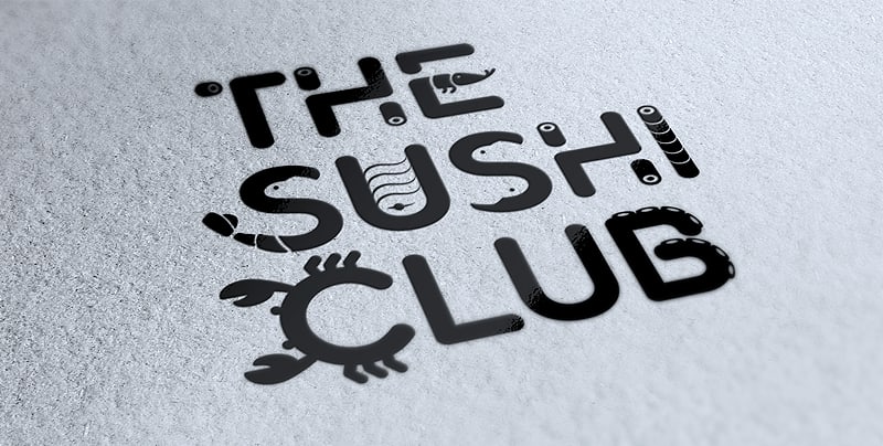
Your logo should be unmistakably yours. Distinctive logos stand apart from competitors and avoid blending in with current design trends that may fade quickly. The most effective way to achieve this is to anchor the design in your brand story — what you do, who you serve and how you want to be perceived. This gives you a clear creative direction and helps you make choices that feel intentional rather than trendy for the sake of it.
Source: logo design by goopanic via 99designs by Vista
This expectation has only grown stronger in today’s digital landscape. Logos must remain recognisable whether they appear as a shopfront sign, a circular Instagram avatar, a TikTok profile image or a tiny app icon. Essentially, a distinctive logo ensures you have a competitive edge in these small, high-speed environments.
A well-known example is the shift from the original YSL monogram to the simplified ‘Saint Laurent’ logotype, which drew criticism for looking like many other fashion brands and losing some of its historic personality.
On the opposite end, Apple’s bitten apple is simple, iconic and impossible to confuse with anything else. The shape is so distinctive that the logo remains recognisable without colour, text or detail — whether it appears on a laptop lid, a billboard or a tiny mobile button.
Relevance
A logo should connect with the audience it’s meant for. That requires understanding who they are, what they value and how they interpret visual cues. Audience research can include anything from age and interests to category norms and cultural context.
This principle also applies across modern media formats. A mark that resonates on packaging or signage must still feel relevant in motion graphics, animated profile headers or AI-generated brand applications. If the tone or symbolism feels off, trust and recognition weaken. Effective logos meet people where they already are — on screens, in feeds and in fast-scroll environments — and still deliver the intended meaning.
The Tour de France logo is a good example of relevance in action: the cyclist embedded in the lettering captures the energy of the event while staying approachable for casual viewers.
By contrast, the Planet Fitness logo often feels visually disconnected from the brand’s welcoming positioning, leaning heavily into ‘serious gym’ imagery, despite the company’s focus on accessibility and comfort. Both old and redesigned logos feature rather unusual colours and fonts for the industry.

Source: Planet Fitness logo via Logos-World
Simplicity
Simplicity remains one of the strongest predictors of whether a logo will hold up in real-world use. Clean shapes, limited detail and clear typography make a mark easier to recognise at a glance — whether it appears on packaging, a mobile screen or a fast-moving social feed.
This matters even more in today’s ecosystem of favicons, app icons and social-media avatars. Highly detailed marks often lose definition at small sizes, break down in dark mode or become unrecognisable when cropped into a circle. Simple logos avoid these pitfalls and retain their clarity across sizes, backgrounds and formats — including monochrome versions.
The Kraft Foods 2009 logo is an example of a not-so-great logo. It incorporated multiple colours, a swoosh and several design elements competing for attention, creating a cluttered look that lacked a clear focal point.

Source: 2009 Kraft Foods logo via 1000logos
By contrast, the Nike Swoosh demonstrates how simplicity helps a logo stay legible and distinctive in every format, including tiny digital placements.
For small businesses, this clarity is a genuine advantage. A simple logo travels well across every platform and remains instantly recognisable wherever customers encounter it.
Need some inspiration? Explore these logo colour combinations for design ideas!
Timelessness
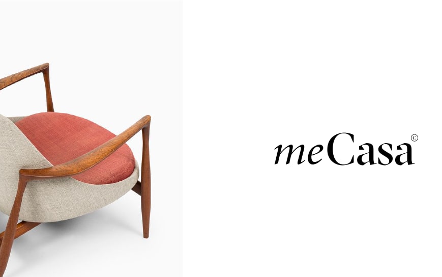
Good logos last. Logo trends come and go, but a timeless logo gives your brand the stability it needs to build recognition over the years, not just a season. This doesn’t mean a visual identity can never evolve. Many enduring brands go through logo redesign as they grow, but the core idea stays familiar enough for customers to recognise it immediately.
Learn from the history of Pepsi and find out how the company made changes throughout the years and still stayed true to its brand.
Timelessness matters even more in the era of AI-assisted design. Tools can generate thousands of concepts instantly, but the best logos still come from a thoughtful understanding of your brand, not a trend-driven prompt. Choose ideas that support your long-term brand narrative, not just what looks current today.
Source: Logo design by smiDESIGN via 99designs by Vista
Some redesigns illustrate the risk of drifting too far from what made a logo memorable. Jaguar’s 2024 logo update, for instance, softened the mark’s character and lost some of the strength that defined earlier versions, sparking debate about whether the new look still conveyed the power associated with the brand.

Source: Jaguar logo via The Autopian
Meanwhile, Coca-Cola’s script logo shows how refinement (rather than reinvention) can preserve recognition across generations.
Adaptivity

Source: Logo design by annalisa_furia’s via 99designs by Vista
Modern logos have to work in more places than ever. They appear on packaging, websites, social media profiles, email signatures, mobile apps, product labels and even motion graphics. They need to function in light and dark mode, scale from a shopfront sign to a tiny app icon and stay clear whether printed in full colour or shown in black and white. Adaptivity is the quality that allows a logo to stay recognisable across all these environments.
A well-designed, responsive logo should be able to:
- Scale cleanly, looking sharp on a billboard and as a 16×16 px favicon
- Work in multiple layouts — horizontal, stacked and icon-only versions that still feel like the same mark
- Hold up in motion, remaining legible in animated intros, short videos and looping social stickers
- Support flexible colour use, working in full colour, one colour and reversed treatments
- Stay recognisable when cropped, especially inside the circles and squares used for social avatars
Adaptivity also depends on delivering the right files and colour systems:
- Vector formats (SVG, EPS, AI) scale without losing quality and are essential for print, signage and embroidery
- Raster files (PNG, JPG) are used for websites, social profiles and email
- Colour systems: RGB for screens, CMYK for print and Pantone for precise colour matching
Testing orientation is equally important. The Office of Government Commerce logo looked fine upright but revealed an unintended image when rotated — a reminder to check how a design behaves in every context. By contrast, the Spotify icon shows adaptivity at its best: a simple circular form that scales cleanly, works in motion and stays legible in both light and dark mode.
Source: Logo design by goopanic via 99designs by Vista
How AI logo makers contribute to a consistent visual identity
AI logo tools can help small businesses keep their branding consistent by taking care of the technical work that often leads to mismatched colours or blurry graphics. They generate clean, well-structured files that hold up across every place your logo appears, from packaging to social media.
Key advantages include:
- Reliable scalability: Vector outputs keep your logo crisp on everything from signage to small digital icons.
- Consistent colour performance: Versions for different colour systems are prepared automatically, so your palette stays true across print and digital.
- Built-in layout variations: Horizontal, stacked and icon-only formats come ready to use and share the same proportions.
- High-resolution exports: Every file is produced at the right quality, preventing pixelation and other issues caused by manual resizing.
How to evaluate logo design [Checklist]
Once you understand what makes a good logo, the next step is assessing whether your own design meets those standards. A useful evaluation focuses on clarity, relevance and performance across real environments — not personal preference.
A strong logo should be able to answer ‘yes’ to questions like:
- Does it communicate the brand clearly? (Purpose, tone, category cues)
- Is it distinctive in your competitive set?
- Is it legible at small sizes, in motion and in low-contrast situations?
- Does it work in black-and-white and single-colour versions?
- Does it remain recognisable when cropped or placed inside a circle/square?
- Are the shapes, typography and colours consistent with your long-term brand direction?
To make it easier, put together a logo checklist of all the elements you value. Go through it after brainstorming logo design concepts and creating the first logo draft to see what works well and what needs to be done.


