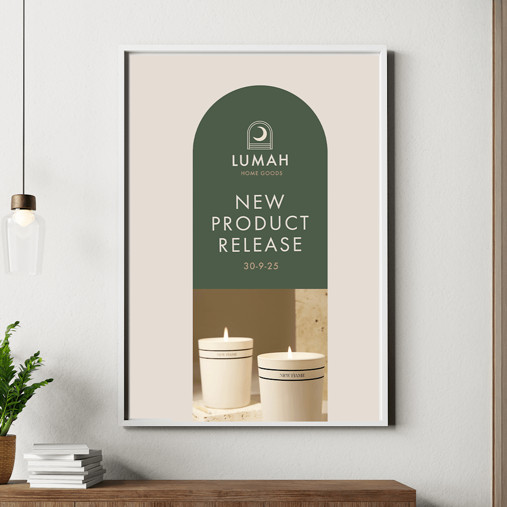
Choosing the right font for your poster plays a key role in how your message is received. It can determine whether your message gets noticed, understood, or ignored. From shop window displays to event announcements and marketing materials, fonts play a big role in how your poster looks and feels.
This guide walks through what makes a good font for posters, how to choose the right one, and a list of tried-and-tested favourites to get started. Plus, if you’re designing with VistaPrint, you’ll also find tips to get the most from our custom poster templates.
What makes a good font for posters
There are a few design principles that make a font well-suited to posters:
- Readability: Your message needs to be legible from a distance.
- Boldness: Strong lines, clear shapes, and enough contrast help your words stand out.
- Tone matching: Choose a font that fits your brand or the purpose of your poster (e.g. professional, playful, creative).
- Weight and spacing: Use bold weights for headlines and ensure enough line spacing so letters don’t feel cramped.
- Designed for print: Some fonts look great on screen but lose clarity in print — always test before finalising your design.
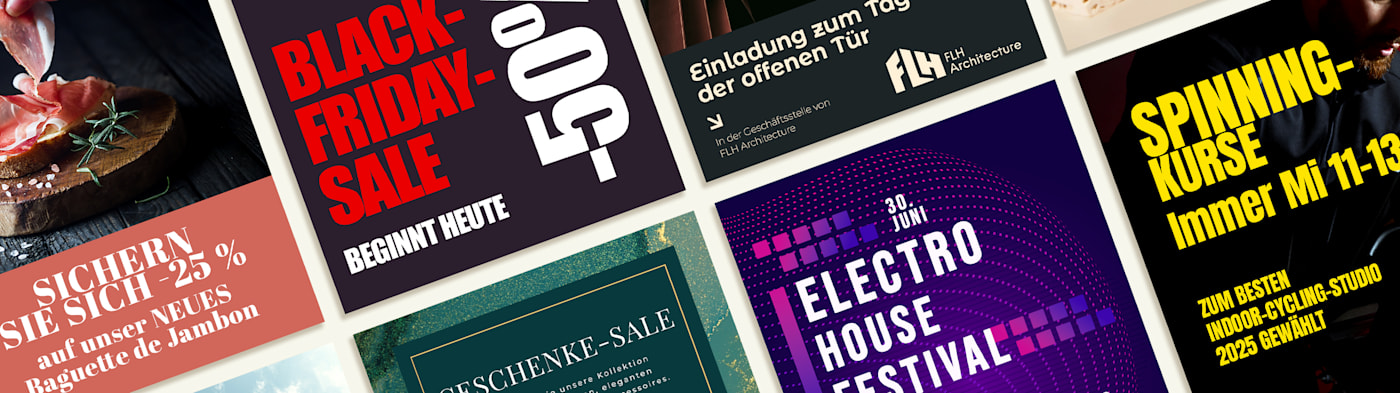
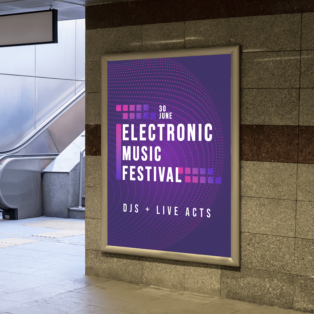
Top fonts for posters
Here are some standout fonts that are easy to read, eye-catching, and widely available in design tools.


1. Impact
Why it works: Thick strokes and a tight structure make it great for bold headlines.
Best for: Sales posters, promotions, event announcements.

2. Futura
Why it works: Modern, geometric style with clean lines that give a professional feel.
Best for: Product launches, contemporary brands, sleek layouts.
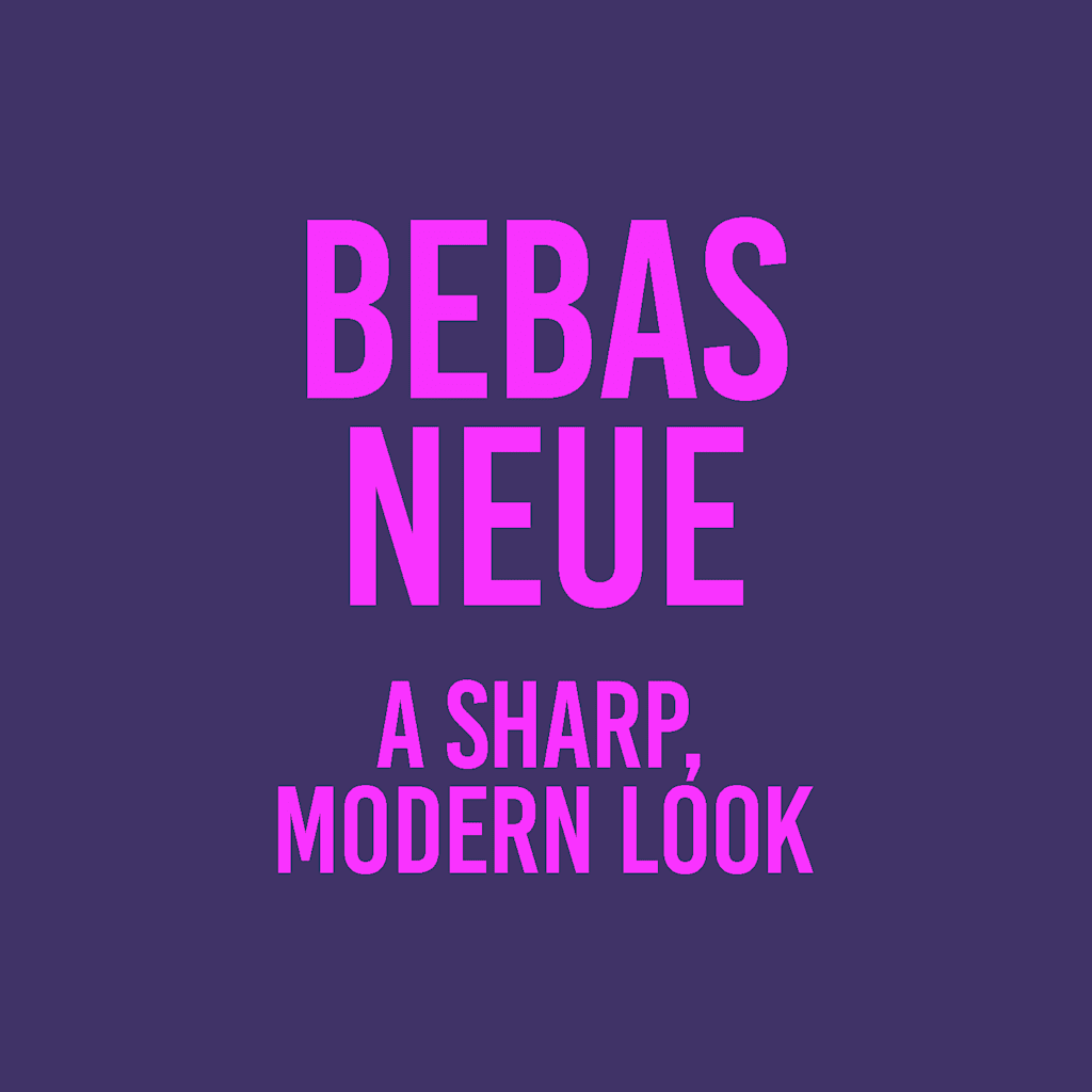
3. Bebas Neue
Why it works: All-caps sans serif font with a sharp, modern look.
Best for: Music events, film posters, creative businesses.
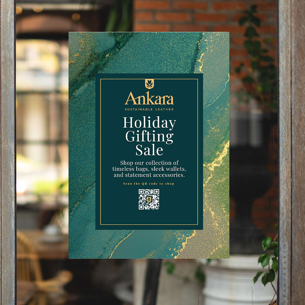
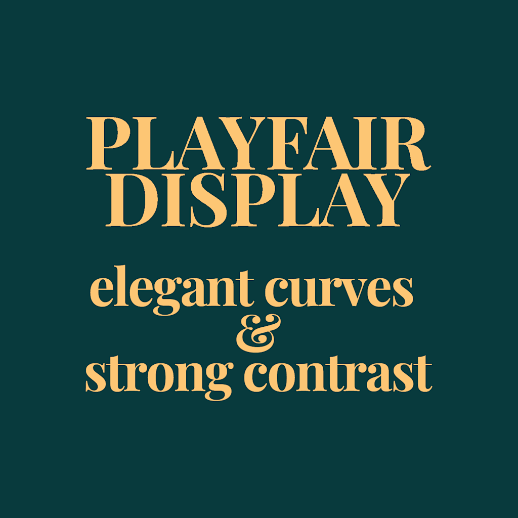
4. Playfair Display
Why it works: Stylish serif font with elegant curves and strong contrast.
Best for: Luxury brands, beauty industry, invitations.
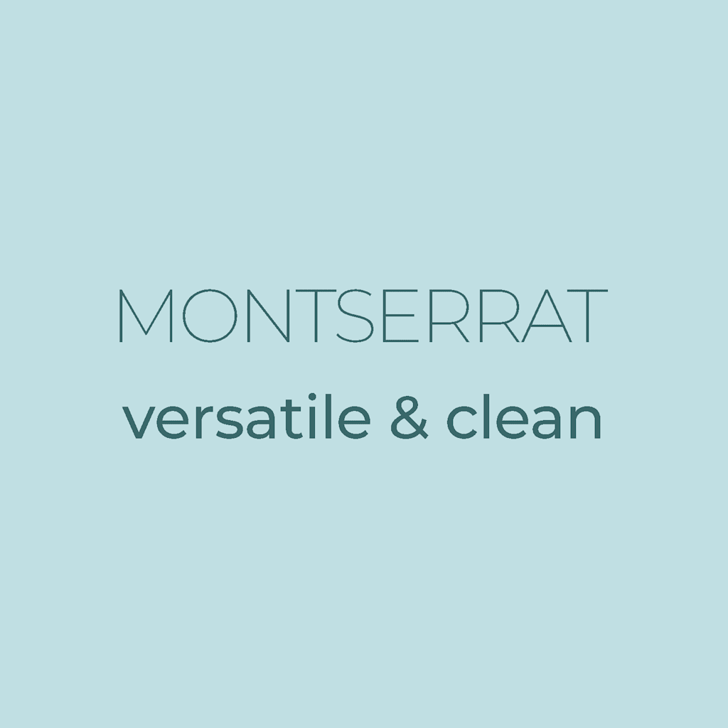

5. Montserat
Why it works: Versatile and clean. Works well in both large headlines and smaller text.
Best for: Corporate posters, real estate, start-ups.


6. Raleway
Why it works: A balance of personality and clarity. Elegant with a modern touch.
Best for: Wedding fairs, boutique businesses, artisan products.

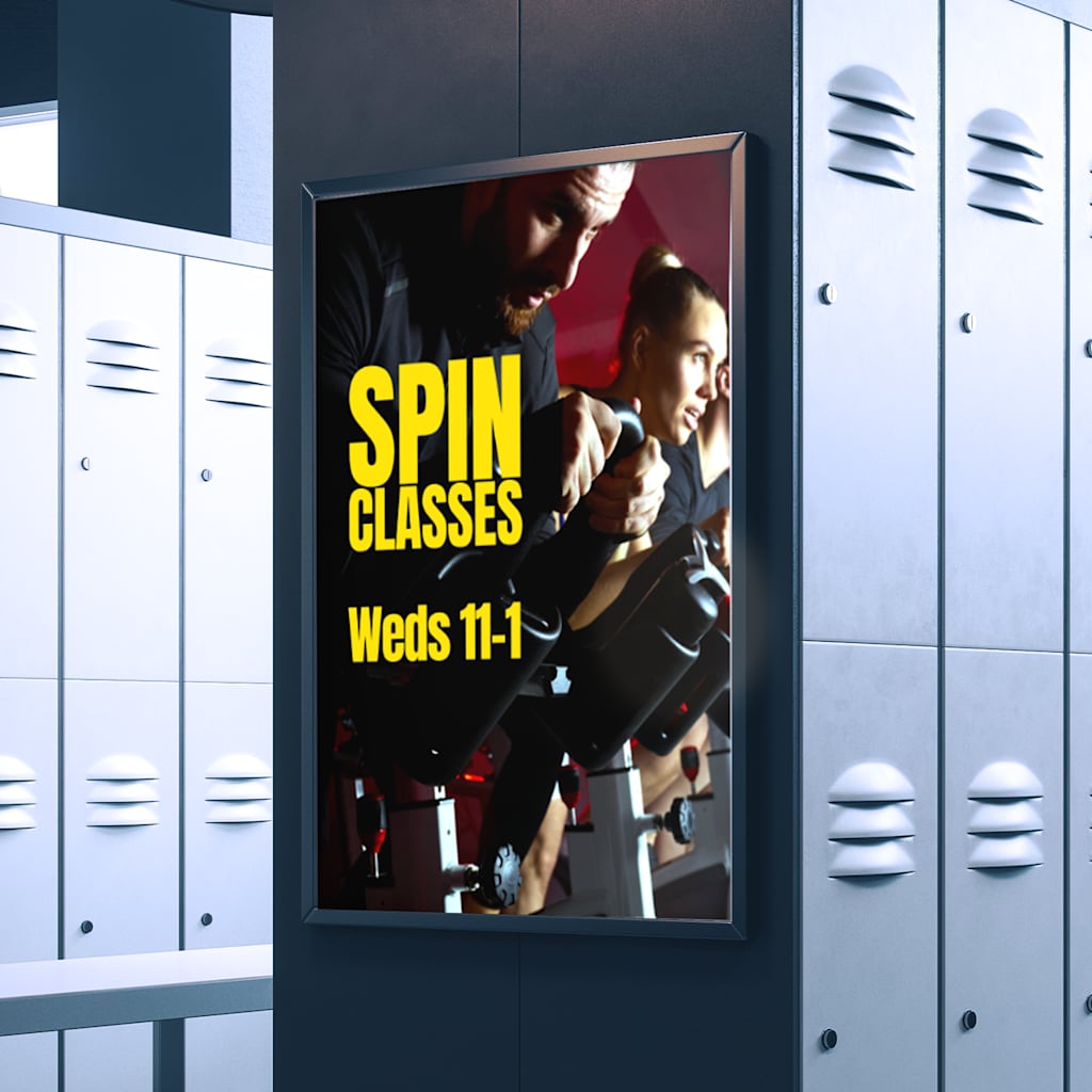
7. Anton
Why it works: Built specifically for headlines, with tight spacing and bold forms.
Best for: Flash sales, gym promotions, strong calls to action.


8. Abril Fatface
Why it works: A bold serif with high contrast and dramatic curves. Eye-catching and stylish.
Best for: Fashion promotions, food posters, special events.
Tips for choosing the right poster font
- Match your brand voice. A playful business might suit a rounded or handwritten style, while a formal one benefits from clean, sharp lines.
- Pair fonts thoughtfully. Use a bold font for the headline and something simpler for supporting text.
- Avoid overcomplicating. One or two fonts per poster is enough.
- Preview at actual size. Use VistaPrint’s poster builder to see how your design looks before printing.