
A brand style guide is an essential tool for businesses that gives clear guidelines on how to communicate a brand effectively. It details the style, voice and intended audience of a company, and ensures consistency across all their communication channels.
But who needs a brand style guide? Almost everyone in a company can benefit, from developer teams through to marketing and creative departments. As a whole, a company needs to know what’s acceptable – and what’s not acceptable – when representing their brand to an outside audience. A brand style guide can help make those rules clearer. This is true for smaller businesses too. If you want to convey your brand across a lot of places (your site, your social media, etc.) then you’ll want to ensure you’re showing up consistently – and recognisably.
But while a brand style guide is important, it doesn’t need to be boring! There are a wide variety of ways to create a brand guide, and every business may choose to create theirs differently. Some stay true to the company’s branding by decorating its pages with the brand’s colour theme, others might display inspirational images to reiterate the company’s vision and mission. And some do a mix of both.
Whatever you decide, there’s a brand style guide for everyone. In this article we’ll share 30 brand guideline examples, why they work so well and some practical design tips you can implement in your own guide.
Jump to
- Use an inspirational image as your brand guide focal point
- Keep it simple
- Adding details for an on-brand finish
- Let your brand style flow
Use an inspirational image as your brand guide focal point
Sometimes, a striking brand guide can speak volumes with just one image. Some brand style guides use key inspirational images to reiterate the brand’s voice and theme.
Think about the images you may have collected at the beginning of the design process—these could be key images that either you found yourself or your designer shared with you. Use these images to help you tell the story of the brand.
Why It Matters:
- Including key inspirational images in your brand guide enhances its storytelling power. These images capture your brand’s essence, evoke emotions, and effectively convey your brand’s unique voice and theme.
- Think about the images you may have collected at the beginning of the design process—these could be key images that either you found yourself or your designer shared with you. Use these images to help you tell the story of the brand.
Practical Application:
Impactful backgrounds: Choose compelling images to serve as striking backgrounds for important pages in your brand guide. This visually anchors key sections, providing continuity and guiding the audience through your brand’s narrative.


truth.’s brand style guide uses on-brand images as the background of certain pages to mark their importance. For example, the brand guide’s section titles are marked with the background images and the content page does not. Via MashCreative®.
This brand guide for Three Ants Communications effectively uses the image of tall buildings as background of the brand’s logo for a strong finish to the overall reading experience. By orangejuice via 99designs by Vista.
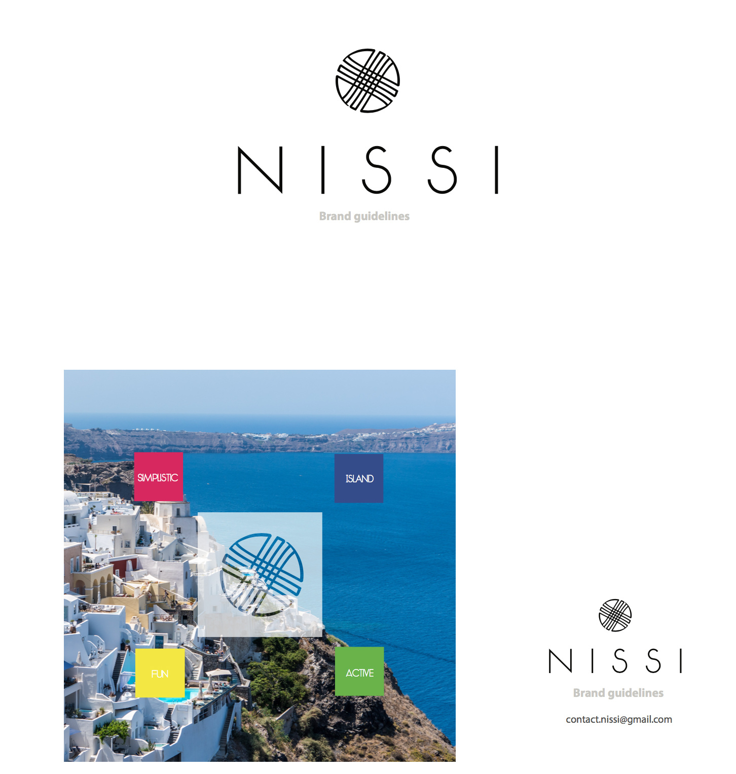
Using the island image as background to the brand logo and the four key themes pull it all together. NISSI brand style guide by Asha7 via 99designs by Vista.
Highlighting brand essence: Select a focal image that embodies your brand’s essence and values. Opt for visuals that are powerful and easily understood, instantly communicating what your brand represents to your audience.


The image of an exotic location speaks to the fact this is a travel blog and that the writer may have personally taken this picture herself. Julie of the World brand style guide by Flavia²⁷⁶⁷ via 99designs by Vista.
In this example, a feature image serves as dual function: as a reiteration of the brand, and an instructional image to show audience the best logo/branding placements. Fitmeal.me brand style guide by Designs By Cat via 99designs by Vista.
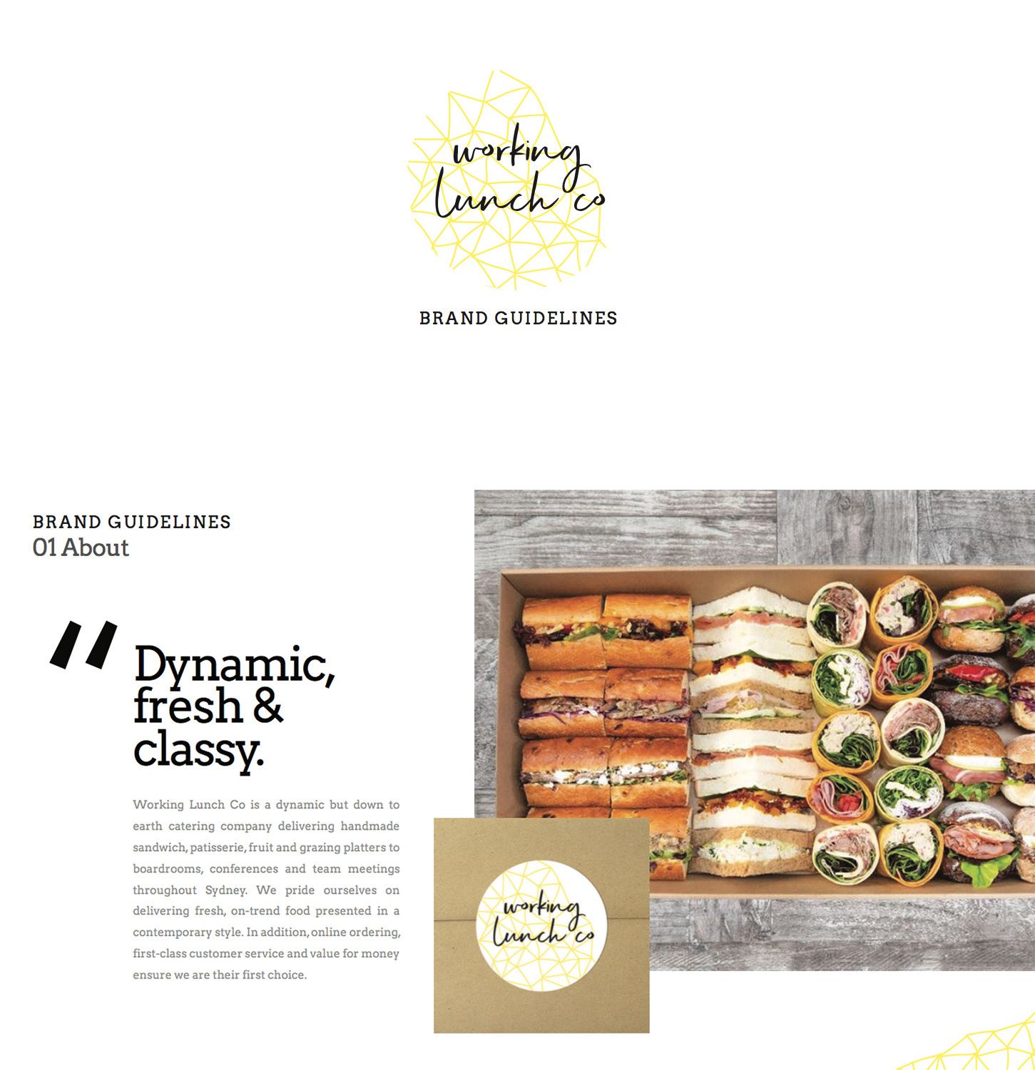
Working Lunch Co. brand style guide by Sarah Crawford via 99designs by Vista.


Image of a clean and neat workspace represents what the company is a service provider of: project management. Legent Inc. brand style guide by eyereen via 99designs by Vista.
Restaurant D brand style guide by HA_Gin via 99designs by Vista.
Design tip:
Think of these images as the visual heartbeat of your brand guide—they should resonate with your audience and reinforce your brand’s personality. Experiment with overlaying text or graphics that complement the image, adding to its impact and ensuring your brand’s story is both captivating and memorable.
Keep it simple
Whitespace isn’t just empty space—it’s a secret weapon in making your brand guide shine. Embracing simplicity and clean design not only boosts clarity but also ensures your brand’s message hits home, no matter what field you’re in.
Why white space matters:
- Focus on the essentials: Whitespace acts like a spotlight, drawing attention to what really matters in your brand guide. Whether it’s your logo or key visuals, giving them room to breathe makes sure they stand out.
- Clear and easy on the eyes: It’s not just about looking good—whitespace helps organise information. By creating space around text and images, your guide becomes more inviting and less overwhelming.
- Smooth and easy to navigate: A clutter-free layout means your audience can move through your guide effortlessly. Whitespace keeps things neat and helps maintain a natural flow from start to finish
In the examples below, notice how a page dedicated to minimal elements—like logo design or key brand images—allows these elements to shine and command attention.
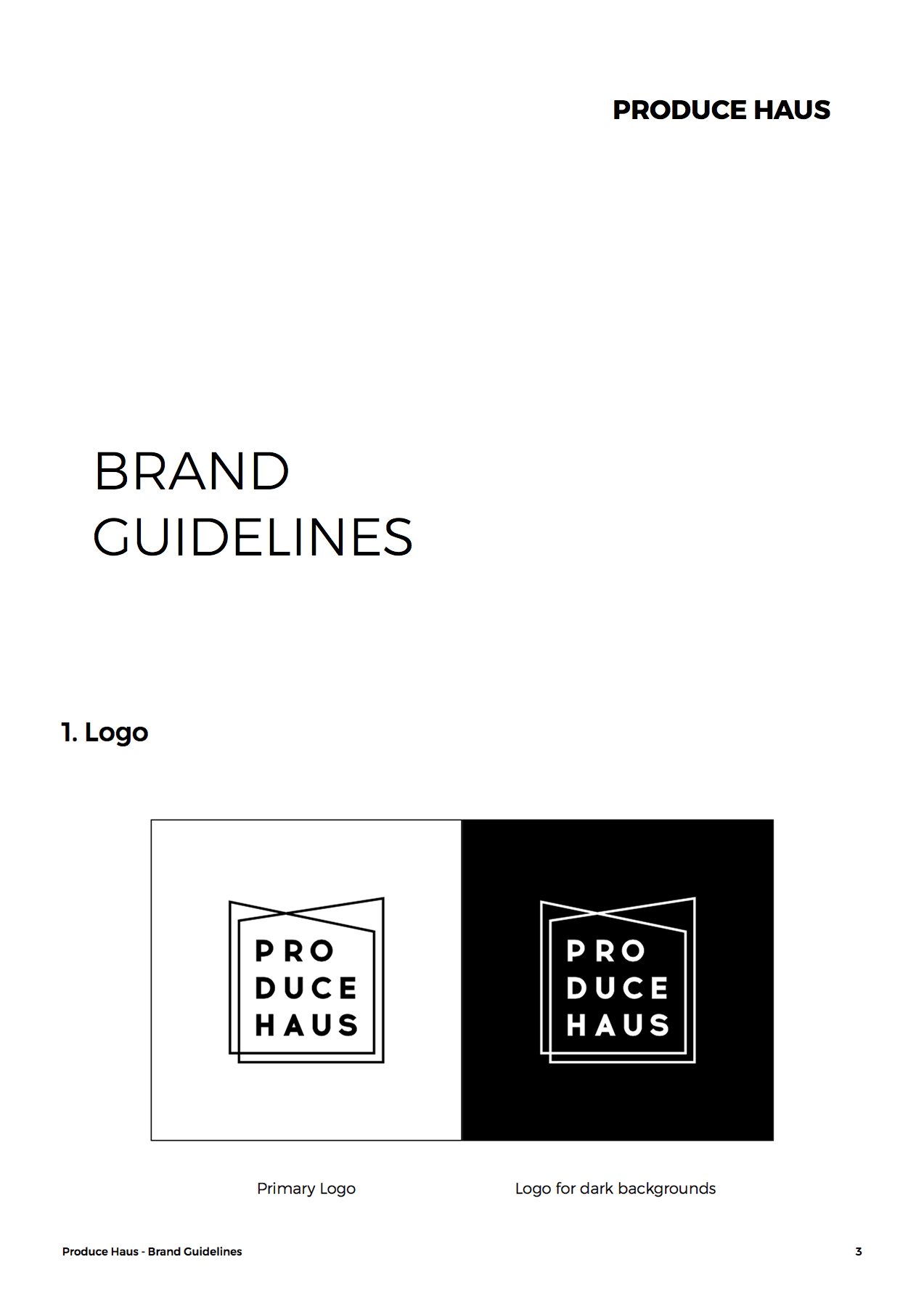
Produce Haus brand style guide by 3whales studio via 99designs by Vista.


WorkBites brand style guide by Vuk N. via 99designs by Vista.
Clever and Quill brand style guide by max | m via 99designs by Vista.
Secondly, whitespace acts as a separator between different parts of information. It ensures the audience can properly ‘breathe’ before moving on to the next piece of the information and follow the intended flow of the guide.
Practical applications:
- Logo and brand elements: Make sure your logo and main visuals get the spotlight they deserve by surrounding them with whitespace.
- Balance text and images: Use whitespace to break up text-heavy sections, making sure each element stands out without competing for attention.
Design tip:
Think of whitespace as your brand guide’s best friend. It’s not about having less—it’s about making every element count. A clean, simple layout not only looks professional but also makes your brand more memorable.
In the following examples, the space around the text becomes an effective separator between the images which are full of texts and that without the space, they would otherwise look convoluted and busy.


LifeVault brand style guide by Terry Bogard via 99designs by Vista.
The letter ‘D’ (which essentially acts as the branding in the page) is let to breathe with the white space around so that it’s not confused with the image and text to its right. SOUND UK brand style guide by I Want Design.
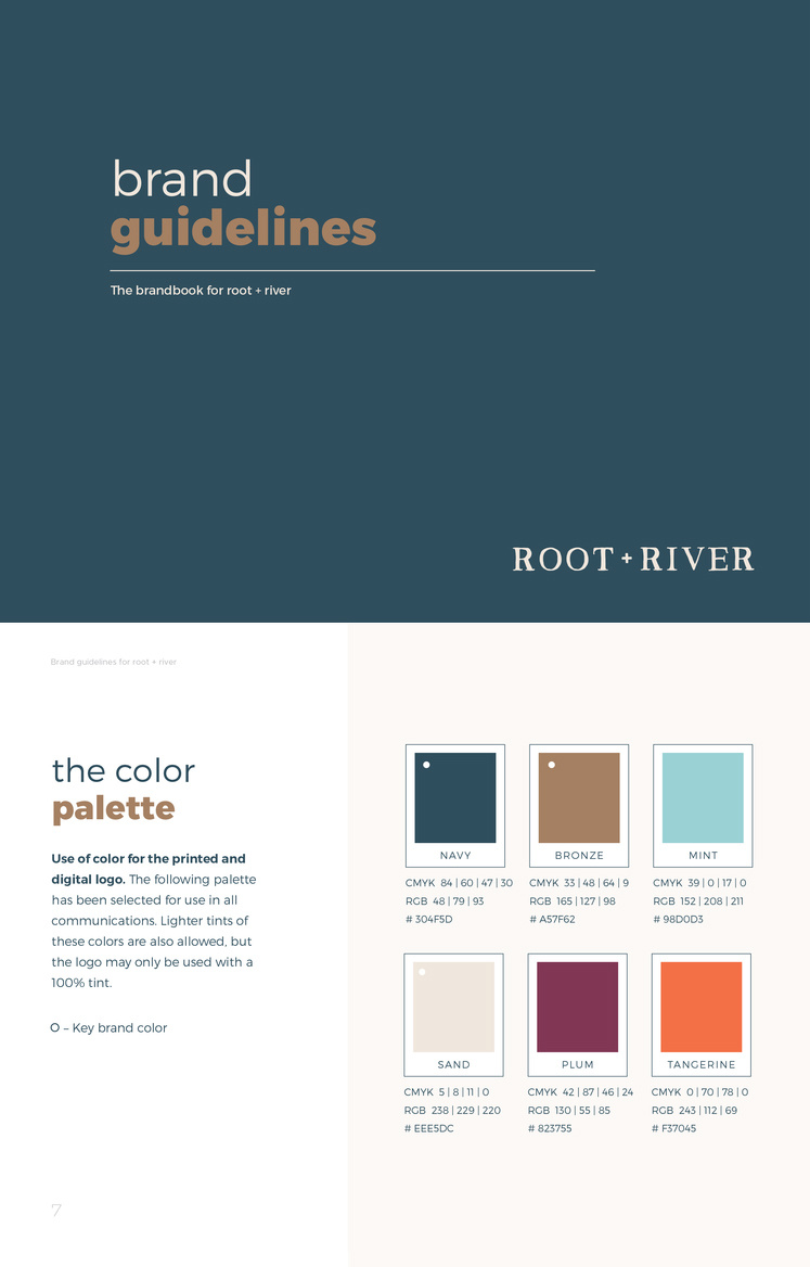
Root + River brand style guide by Pace Creative Design Studio
Adding details for an on-brand finish
Staying on brand is good, but staying on brand with style? Even better. Think about how to add brand details to certain pages of the brand guide that will lift it to the next level. These designs play around with the layout, as well as adding shapes and colours that call back to the brand to personalise the guide’s overall look.
As shown in the following examples, the result is a cohesive branding bible anyone will be happy to refer to at any time.
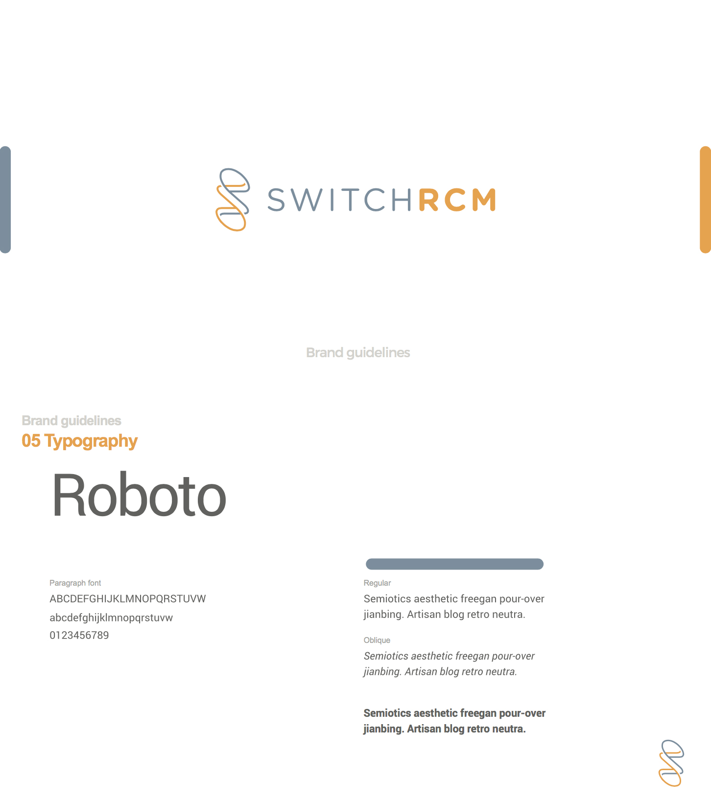
In this brand style guide for SwitchRCM, the designer took care to include the brand’s logo in each page to subtly reiterate the branding throughout the viewing experience. By Terry Bogard via 99designs by Vista.


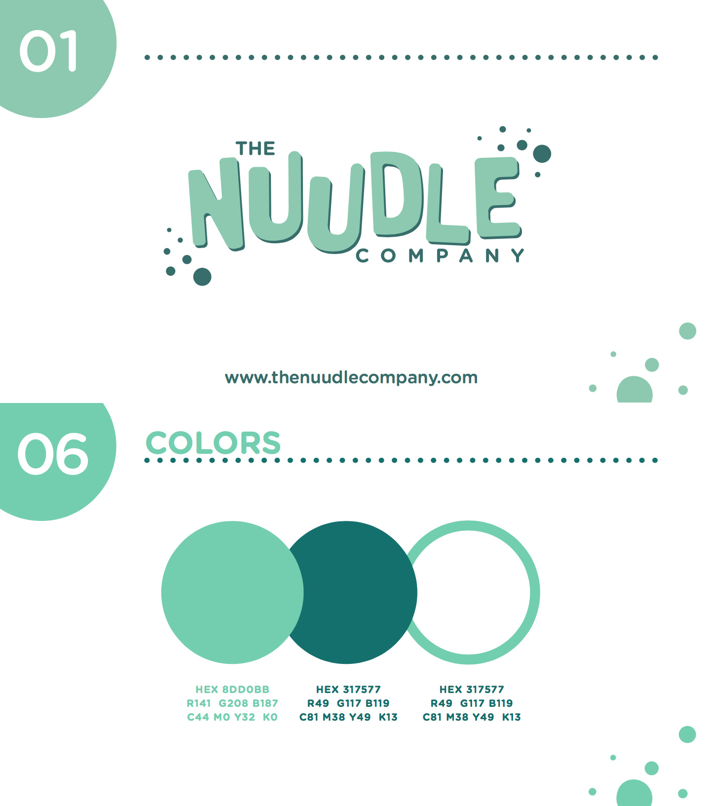
The Nuudle Company brand style guide by E·the·re·al” via 99designs by Vista.


Why details matter:
- Personalise with purpose: Adding brand-specific details isn’t just about looks–it reinforces your brand’s identity. Whether through custom layouts or subtle design elements, each detail should resonate with your brand’s story and values.
- Cohesive visual storytelling: By using shapes, colours, and patterns that reflect your brand, you create a unified visual narrative. These elements tie everything together, making your brand guide a comprehensive resource that’s both functional and visually appealing.
Practical application:
- Strategic use of brand colours: Integrate your brand’s colour palette thoughtfully throughout the guide to maintain consistency and reinforce brand recognition.
- Explore different layouts: Experiment with various layouts that complement your brand’s style and improve readability. Consistency in layout reinforces brand identity across all communications.
Design tip:
Think of your brand guide as a canvas where every brush stroke contributes to the masterpiece. By adding thoughtful touches that align with your brand’s personality, you not only amplify visual appeal but also reinforce your brand’s authenticity and professionalism. Remember, consistency in design and a focus on key brand elements ensure your guide remains not just informative, but also a compelling reflection of your brand’s identity.
Let your brand style flow
Sometimes the audience needs that extra helping hand to keep them focused on what they’re seeing. It’s especially nice to see your reading flow visualised in attractive graphics.
Why brand style flow matters:
Effective brand guides use elements that span multiple pages, creating a cohesive visual journey. This approach ensures that every part of the guide contributes to a unified brand experience, reinforcing brand identity and message consistently.
The following designs use elements to straddle multiple pages of the brand guide to convey a sense of continuity. For example, Quiqup’s brand guide below uses cursive, flowing lines to gently guide the audience from one page to the next. The result: they are subliminally reminded that they are viewing Quiqup’s brand and strengthen the brand effect in their minds every step of the way.
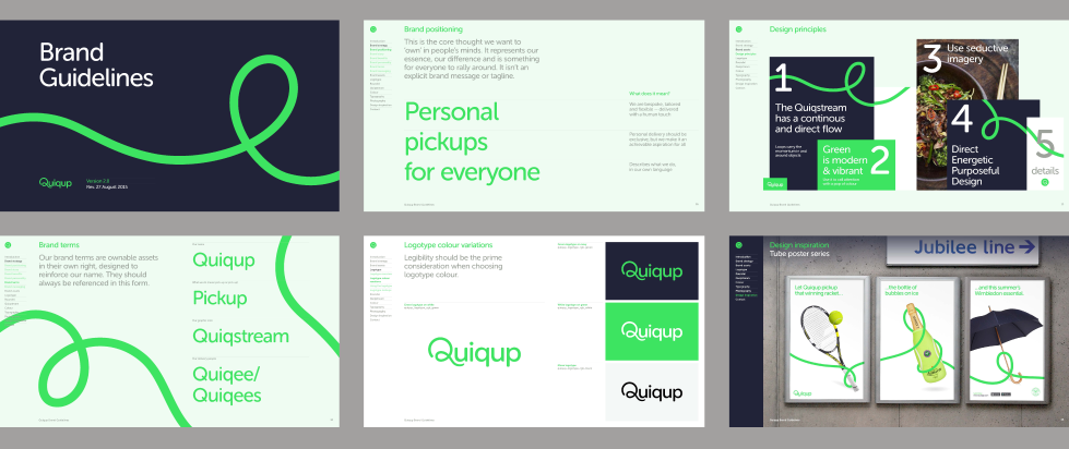
A brand style guide for Quiqup that has the right flow. Via MultiAdaptor.

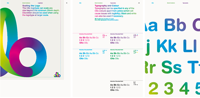
Ollo is another example that uses flowing line in its brand guide to emphasise its brand. The decorative colourful line reiterates on the logo to remind the audience just whose brand guide they’re viewing. By Bibliothèque Designs
Practical Application:
- Seamless continuity with design elements: Utilise flowing lines and motifs that traverse multiple pages, like in Quiqup’s brand guide, to guide the reader effortlessly from one section to another. This subtle continuity reinforces brand presence and aids in brand recall.
- Strategic placement for cohesive experience: Place on-brand images and text strategically across adjacent pages to create a seamless reading experience. This technique ensures each element contributes to the overall narrative flow and enhances readability.


Design tip:
Think of your brand guide as a dynamic storyboard—each page unfolds like a chapter, leading your audience deeper into your brand’s narrative. To enhance this journey, consider using interactive elements, subtle animations, or interactive links that encourage exploration and interaction. These additions not only enrich the user experience but also reinforce your brand’s personality and values in a memorable way.
Do you have an idea for your brand guidelines?
Remember, the sole purpose of brand guidelines are to always inform your audience how to communicate a brand effectively. We love a seriously attractive brand style guide, but at the end of the day, if it doesn’t do its job properly, then it loses its significance quickly.
Test out your freshly-designed brand guide with various layers of your company. After all, they must all benefit from it and understand clearly how to represent your brand, so make sure creative flair doesn’t get in the way of equally important communication skills.
Want to learn more? Here are our top branding tips and here’s how to create a solid brand identity for your business.
Author: Sasha Manusama
